The psychology of colour in marketing
- Dominic Parker

- Jul 21, 2023
- 21 min read
Updated: Aug 12, 2025
Logo colour tricks
A good logo is synonymous with the brand it represents. Think about iconic brands such as McDonald's or Apple. Their logos are like an instantly recognisable shorthand for the business itself.
A logo is essentially a symbol used to represent a brand. Dig deeper and you’ll find that many logos have a hidden meaning, often something that relates to the company’s backstory or a clever visual pun. After all, branding is all about storytelling—its how humans connect.
But there’s another element that makes up the story of a logo: Its colour.
A logo’s colour can say a lot about a brand. For established brands, a colour can be intrinsically linked to the business’s identity. Think of Starbuck’s famous white and green coffee cups or Cadbury’s iconic purple wrapping. And for new brands, their logo colour is an attempt to position their business with their desired customer.
Canva inspired me with a similar article to look at look at how big-name brands use colour in their logos, dive into the patterns revealed by popular logo choices and take a closer look at the big businesses that think outside the square.
One reason people create logos in the first place is that visual recall is a powerful thing. And that’s exactly why we’ve put together this logo colour wheel—at a glance, you can see exactly how big-name brands use colour.

What does it mean?

Conscious and unconscious decisions
As a consumer, when we choose a product, service or brand comes down to making a set of decisions. Some are decisions are very conscious and comparable, such as the price of a product or the technical specification against competing products. Then, there are the unconscious decisions. We would class these decisions as the ones that your brain makes before you even realise.
Colour plays a big part in the unconscious decisions we make, not just in choosing a product or service, but even in every day life. For example, if you see a road sign that’s in red, it’s most likely quite a serious one that’s telling you that you must do something, such as STOP or 30MPH. That choice in colour is not by coincidence, psychologically we see red as conveying urgency. So, with that in mind, think about why so many ‘50% off SALE’, or ‘SALE MUST END SUNDAY!’ signs are in red. While it may not be a life or death situation like when we’re driving, we tie the idea of seeing a red sign to it being something we should read with urgency, caution or attention. It’s a clever piece of marketing at capitalises on colour psychology. Two very different pieces of signage, but both use the colour red to evoke a certain emotion in the reader.
Logo colour and brand identity
The link between colour and brand identity is strong. In the Journal of the Academy of Marketing Science, researchers Lauren Labrecque and George Milne explain that “like a carefully chosen brand name, colour carries intrinsic meaning that becomes central to the brand’s identity, contributes to brand recognition, and communicates the desired image.”
In their research on colour differentiation in the marketplace, Labrecque and Milne highlighted how certain industries frequently use particular colours.
For instance, they found that blue is used in over 75% of credit card brand logos, and 20% of fast food brand logos. Red, meanwhile, is found in 0% of apparel logos—but over 60% of retail brands.
For consumers confronted with advertising thousands of times a day, these visual cues can be an unconscious message about what they’re being sold, and by whom.

Colour psychology and logos
It’s impossible to talk about logo colours and branding and not mention colour psychology. This area of study looks into the relationship between certain hues and human responses.
Proponents of colour psychology believe you can use the theory to trigger particular behaviours in customers.
Without a doubt, researchers and marketers have picked up on patterns in human responses to colours. But none of these are watertight: One person might think of red as an exciting, appealing colour—and the next person might associate it with blood and gore. Context and the intended audience is essential. Black can be stable and dependable in one context, or edgy and rugged in the next. And factors like culture, gender, and age mean different colours are perceived in various ways by different people.
In other words, colour psychology isn’t black and white.
The lesson here? There isn’t a colour that will automatically guarantee success for your brand—but choosing the wrong colour can mean your brand is overlooked by your target market.
There are, however, strong associations with particular colours in the mind of consumers. These flow both ways—the association between orange and energy might not be inherent to the colour itself, but instead is a result of the fact that it’s so often used by brands who want to convey this message. Consumers see this colour and know, subconsciously, that there’s a subtle message being conveyed. In this way, colour psychology becomes a self-fulfilling prophecy.
There is also a physiological aspect to colour. Think about when you see a fluorescent sign: Sometimes the colour can be so bright that you have to squint. There’s no denying that certain colours are bold and eye-catching, while others are more subtle and gentle on the eyes.
Certain companies use this to their advantage—for example, McDonald’s, whose logo is frequently seen in crowded food courts or as a Drive Thru destination on the road. In these situations, the bright yellow of the golden arches acts as a siren call.
Logo trends
Logos aren’t immune to trends. Many brands update their logos every five years or so, allowing them to stay on top of current trends, while also staying true to their core brand identity. Think about your business goals when deciding whether or not to follow logo design trends – if you’re creating a small business drop-shipping fidget spinners, then it makes sense to follow trends; but if you’re looking to create a business that’s around for decades, aim for something timeless.
Common colour associations and colour symbolism
Let’s take a closer look at the associations commonly brought to mind by colours—and backed by research.

A lot of the inspiration for this blog came from Canva and their writings on the use of colour. I wanted to share this nice little tool to create your own logo with all you know about colouring:
Canva's 3 steps to creating your own logo
01. Industry research
Ask yourself, what’s this business all about—and who is the audience? Remember that your logo should appeal to your ideal customer. And remember to look at the competition. Your brand strategy will determine whether you’re more comfortable creating something that breaks with industry tradition, or keeps to the established trends—but knowing what else is out there is crucial.
02. Choose your logo type
There are two dominant kinds of logo: wordmarks and symbols. A wordmark is where the name of the company is the focus of the logo. This kind of logo relies on a good typeface and strong colour choice. A symbol logo relies on iconography to make the brand recognisable.
03. Choose your colour scheme
Think about the associations you’d like people to make with your brand. What colours best support this? The colours you choose will probably have a life beyond the logo – they might appear on your website, or business card designs, etc.
Want to take the hard work out of designing a logo? Try Canva’s logo maker.
The history and psychology of colours
It's believed that artists invented pigments using a combination of soil, animal fat and burned charcoal as early as 40,000 years ago. In this article, we deep dive into the history of colours and the colour psychology behind them.
In today's society, colour is perhaps something we take for granted. With one simple click, we have thousands of colours at our disposal. But, much like the science behind colour psychology, there's also the history of colours. Below, we learn about how some of our favourite colours were created and how they have evolved to form meaning in society and through design.
01. Blue
Blue is a colour that has long been associated with royalty, art, military, business and nature, making it a colour with a lot of applications.
The first documented use of blue pigment is using blue azurite, a vivid deep blue naturally occurring mineral, used widely in ancient Egypt for decoration and jewellery. Later, in the Renaissance, the mineral was crushed and used as the expensive paint pigment ultramarine.
Azurite is a deep, almost purple shade of blue
From here blue would go on to live a long life in the world of art, from stained glass windows in the Middle Ages, fine blue and white porcelain in China through to famous applications by artists such as Renoir and Van Gogh.
US and UK public opinion surveys have found that blue is a majority of men and women’s preferred colour, making it quite a popular hue.
Blue is also thought to promote trustworthiness, serenity, and productivity amongst other positive traits, the use of the colour dominates tech, financial and medical branding.
02. Red
Red is a rich colour with an even richer history. Use of the pigment can be traced way back to Ancient Egypt where it was considered both a colour of vitality and celebration, as well as evil and destruction. From here on, red was a staple hue throughout history, used in ancient Grecian murals, in Byzantine clothing to signal status and wealth, and heavily applied throughout art movements ranging from the Renaissance through to modern day art.
Red is considered to be a colour of intense emotions, ranging from anger, sacrifice, danger, and heat, through to love, passion, and sexuality.
In many Asian countries such as India and China, red is regarded as the colour of happiness, well-being, and good fortune.
In the world of branding, red can signal a whole host of different ideas, depending on the specific shade. For example, a darker red often signals luxury and professionalism. A bright, intense red signals excitement, energy, and efficiency. A cooler, deeper burgundy is often more sophisticated and serious whereas a brown-tinted maroon red is courageous and strong.
Red is also a colour that is thought to stimulate appetites and hunger, making it a popular choice when it comes to food industry branding. Think of Fritos, Jack in the Box, Coca-Cola, McDonalds, etc.
When it comes to branding red is also often used to promote speed, energy, and efficiency. Netflix, Suzuki, and RedBull are all brands that use red to promote life in the fast lane.
Red is also often seen being applied as a colour to promote creativity in electronic/software brands. Adobe, Canon, Nintendo are all prime examples of this in action.
03. Yellow
Heralded as the colour of sunshine and gold, yellow is a vibrant, historic colour. Deriving the pigment from clay, yellow is thought to be one of the first colours ever used as a paint in prehistoric cave art, with the first application thought to be over 17,300 years old.
Ancient Egyptians were pretty prolific users of the colour too. Thanks to its close association with gold, the colour was considered eternal and indestructible. Yellow has a longstanding relationship with the world of art, with artists such as Van Gogh adopting it as a signature colour to signal warmth and happiness.
Amongst these associations, Yellow is a colour that embodies many ideas depending on the shade and application. As previously mentioned it can symbolise happiness, sunshine, good energy, and joy.
However, it can also represent cowardice, betrayal, terror, and illness. Interestingly, the latter of these associations is thought to be due to the fact that yellow pigments are often found in toxic materials.
Furthermore, as yellow is the most visible colour of the spectrum, it is often used for emergency and cautionary signage, clothing, and applications. If you need to grab attention fast, use a bit of yellow.
In Japan, yellow is thought to represent courage, and in some parts of Mexico certain shades can are thought to represent death.
When it comes to branding, yellow can be applied to signal a range of ideas. For example, it is often used to signal speed and efficiency, as we can see embodied in brands like Ferrari and Sprint.
It can also signal, of course, happiness and joy. Think of brands like Snapchat and McDonald’s that promote a culture of enjoyment and fun.
Yellow is also a colour that promotes the idea of wisdom and knowledge in certain brands. National Geographic, BIC, Commonwealth Bank, are all prime examples of this theory in action.
04. Green
Named after the Anglo-Saxon word grene meaning “grass” and “grow”, green is a colour with close and distinctive ties to nature, the environment, and all things to do with the great outdoors.
Historically, green was a pigment that did not appear as early in prehistoric art as other hues as it was a hard pigment to reproduce. Due to this, many art and fabric applications of green either turned out a dull brown-ish green, or eventually faded due to the temperamental pigments used. So, it was only when synthetic green pigments and dyes were produced that green was seen more prolifically throughout modern art.
In Western countries, green is seen as a colour of luck, freshness, the colour for ‘go’, jealousy, and greed. In China and Japan, green is seen as the colour of new birth, youth, and hope. However in China it is also a symbol of infidelity as to wear a green hat is considered a symbol of your partner cheating on you.
Psychologically speaking, green is thought to help balance emotions, promote clarity, and create an overall feeling of zen. Green is obviously the colour of nature and health, thus it also has close ties with emotions of empathy, kindness, and compassion.
Paler, softer mint greens often promote ideas of youth, inexperience, and innocence, while deeper, darker greens draw out notions of success, wealth, and money. Vibrant lime green shades promote energy and playfulness, and deeper olive greens are seen as representing strength and endurance.
It can also signal prestige and wealth, as demonstrated in luxury car brand Jaguar’s logo, or the high-end fashion brand Lacoste.
Green can also be used to promote health, the environment, and all-natural products. Just check out Whole Foods or Animal Planet’s logos to see this eco-friendliness exemplified.
05. Orange
Sitting in between red and yellow in the colour spectrum is orange. Historically, orange was used prolifically by the Ancient Egyptians and Medieval artists, the pigment often made out of a highly toxic mineral called orpiment, which contained traces of arsenic.
Before the late 15th century, Europeans simply referred to orange as yellow-red until they were introduced to orange trees, when the pigment was finally awarded its true name. During the 16th and 17th centuries, orange became a symbol of Protestantism and an important political colour in Britain and Europe under William III’s reign.
Throughout art in the 18th and 19th centuries, orange became a symbol of impressionism thanks to artists such as Renoir, Cezanne, and Van Gogh.
Orange has different tones and shades, each with different meanings and effects.
For example, light pastel peach tones are seen as sweet, conversational, and affable, whereas more intense, vibrant oranges are seen as representative of vitality, energy, and encouragement.
Deeper amber shades are seen as confident, a symbol of pride and self-assertion, and darker orange-brown tones promote ambition, adventure, and opportunity.
In Western countries, orange is often linked to inexpensive/affordable products and is heavily used in relation to Halloween. In Thailand, orange is the colour of Friday, whereas in the Netherlands it is the colour of the Dutch Royal Family.
In terms of branding, orange has a few different applications.
First of all, orange is often used to communicate a product that is affordable and/or inexpensive. Think of Amazon, or Payless shoes’ logos and how they use orange to suggest this.
Orange is also used to elicit feelings of adventure, excitement and risks. We can see this in Harley Davidson, WNBA, or Rockstar Games’ logos.
Alternatively, vibrant oranges are used to promote energy, enthusiasm, and fun. Think of Nickelodeon’s signature orange hue, or Fanta’s bright, enthusiastic use of the colour.
06. Purple
Sitting in between red and blue on the colour spectrum is none other than purple. Purple has long had a noble and fairly regal history surrounding the hue. Due to the fact that producing purple pigments was expensive and difficult, the colour was often worn by those of high status and royal descent throughout the Byzantine and Holy Roman Empires as well as Japanese aristocracy.
From here on out purple remained a colour to symbolize royalty and nobility throughout history until 1856 when the colour became more accessible to the every person and simply became a signal of fashion and style instead. However, purple is still a colour used by the British royal family and will forever remain the colour of the royals.
Purple is a colour that sits in an interesting place on the colour spectrum – right in between warm red and cool blue – making it a colour that can be both cool and warm depending on the specific shade.
Thanks to this, different shades of purple can have significantly different effects.
On the lighter end of the spectrum is lavender. This pale, soft shade communicates femininity, nostalgia, romance, and tenderness.
More vibrant purples promote royalty, nobility, extravagance, and luxury. While deeper, darker shades of purple such as mauve can promote ideas of seriousness, professionalism as well as gloom and sadness in certain applications.
When it comes to branding purple is used in a multitude of ways. One common application is to draw on the historic ties of the colour with royalty to help build a luxurious, expensive, high quality brand. Think of the logos of Hallmark, or luxe whiskey brand Crown Royal.
Purple is also a colour that can promote fun, creativity, and play. Thanks to this, it is often used in children-oriented brandings such as Wonka candy, or platforms that encourage play, such as video game streaming service Twitch.
Purple is also often used frequently in branding to promote knowledge, innovation, and intelligence. Take a look at Yahoo!, SYFY, and NYU’s logos and see how they each use purple to evoke these ideas.
07. Pink
Named after the flower of the same name, pink is a vibrant, feminine colour with an interesting history. Pink does not have as prolific a history in art and culture as some other colours, as more intense shades of red and crimson were often preferred. However, during the renaissance, pink pigments started to be applied more often, as from thereon, the colour worked its way into the world of fashion, art, and design.
Pink is regarded widely in the western world as the colour of femininity. Because of this, it is used to bring awareness to breast cancer, applied to many women’s products, and considered a colour predominately used and worn by women. However, this has not always been the case. Originally it was considered to be a colour suited to little boys, as red was a man’s colour, and pink its younger sister hue. Similarly, in Japan pink is a colour associated with masculinity, the pink cherry blossom trees thought to be symbols of fallen Japanese warriors.
When it comes to shades of pink, softer, lighter tones often promote innocence, girlhood, nurturing, love, and gentleness, and these soft shades are actually thought to increase female physical strength.
However, brighter, more intense shades of pink are instead thought to promote sensuality, and passion, as well as creativity, energy, and, as studies have suggested, the colour is thought to raise pulse rate and blood pressure.
When it comes to branding pink is used in a variety of ways. Arguably the most common application is on brands that predominately cater towards women. As pink is a symbol of femininity in Western cultures, brands like Victoria’s Secret, Priceline, and Cosmopolitan all use the colour to get the attention of their demographic.
Pink is also a colour used to promote creativity, artistic expression, and innovation, as seen in Adobe InDesign’s logo, as well as graphic design social network Dribbble’s branding.
Arguably the sweetest colour of all, naturally pink is also used for sweets, candy, and dessert food brands such as Dunkin Donuts, Baskin Robbins, and Trolli.
08. Brown
Hailed as what studies have shown to be “the least favourite colour of the public”, brown is not a colour to turn a blind eye to. Brown is considered to be one of the first pigments ever used in prehistoric times and has been a staple of art and culture ever since.
Brown has long been a symbol of the lower-class, this association stemming from Ancient Rome when the colour was donned only by barbarians and people of low social and economic rankings. It is also a colour that was worn by the monks of the Franciscan order as a sign of poverty and humility.
However, brown has had quite the revival in modern culture. Now a symbol of all things organic, natural, healthy, and quality, it is a colour with many positive associations.
Brown is not a colour applied throughout branding as prolifically as other hues, but when it is used, it has a few distinctive effects.
As brown is a colour often seen in nature, it has become a symbol of all things organic, authentic and/or natural. We can see this in the branding of brands such as Ugg and Cotton.
Brown is also a shade that promotes reliability, efficiency, and high value service, as seen in the UPS and JP Morgan logos.
Deep, rich browns are often applied to signal high quality and luxe style. Two prime examples of this are Louis Vuitton’s signature brown, and Hollister’s deep brown logo.
And finally, brown is also often used as a colour to communicate warmth, relaxation, and indulgence. It is often chocolate and coffee brands such as MnMs, Nespresso, Hersheys, and many small coffee chains that make use of this application of the hue.
09. White
White is an achromatic colour, meaning it is a colour without a hue. It has been a staple of art, history, and culture for many eras. In fact, it is recorded as the first colour ever used in art, with Palaeolithic artists using white calcite and chalk to draw.
Throughout much of history, white has been elected as a symbol of goodness, spirituality, purity, godliness, and sacredness. Ancient Egyptian gods, Greek gods, Roman goddesses were all depicted as clad in white to symbolise their deity.
White is considered the symbolic opposite of black, with the two colours together forming symbols of good and evil, night and day, light and dark, etc.
In Western cultures, white is the classic colour of wedding dresses, symbolising innocence and purity, whereas in many Asian cultures white is the colour of mourning, grief, and loss.
White is a tricky colour to work with when it comes to logos and brand applications as you can’t have a purely white logo. However, many brands choose to either use slight off-white, grey, or silver tones, or combine the white with black to create striking high contrast logos. White and light off-white colours are often used as a very luxurious colour in branding. Brands like Swarovski use it to promote elegance, sophistication, and to draw comparisons between their logo and crystals/diamonds.
White is also the colour of modern day technology. It is seen as clean, sophisticated, streamlined, and efficient. This association is likely in part thanks to Apple’s prolific use of white throughout their branding.
10. Black
Earning the title of darkest colour thanks to its total absorption of light is none other than black. Similarly to white, black is an achromatic colour (a colour without a hue) and is one with a long history of use and importance that extends into modern day.
Alongside white, black is one of the first recorded colours used in art, the pigment created by palaeolithic who used charcoal, burnt bones, or various crushed minerals.
Throughout much of history, black has been a symbol of evil, (such as the Greek mythology underworld), mourning, sadness, and darkness. However, in Ancient Egypt, the colour had positive connotations of protection and fertility
Black went through many shifts in meaning, application, and perception from era to era and culture to culture. Eventually the colour was revolutionised and given a prominent standing in the world of fashion, quickly becoming a symbol of elegance and simplicity.
Black is seen as a sharp colour that can promote many ideas ranging from sophistication, mystery, sensuality, confidence, through to grief and misery, depending on the application.
In the world of branding, black is a staple. While colour is thought to increase brand recognition by up to 80%, many brands opt for a sharp black logo thanks to the versatility of the shade. Black can promote ideas of power, elitism, and strength. This is often seen in sports brands such as Nike, Puma, and Adidas. The use of bold flat black logos creates striking, bold, punchy brand marks.
Conversely, black is also often used to promote elegance, luxury, and status. This is why we see plain black logos used for beauty and fashion brands such as Schwarzkopf and Chanel as the colour is thought to be timeless and never out of style.
Gender and colour psychology
The Help Scout blog talks about one of the more interesting examinations of this topic is Joe Hallock’s work on “Colour Assignment.” Hallock’s data showcases some clear preferences in certain colors across gender (most of his respondents were from Western societies). The most notable points in his images are the supremacy of the colour blue across both genders and the disparity between groups on purple.
It’s important to note that one’s environment—and especially cultural perception—plays a strong role in dictating colour appropriateness for gender, which in turn can influence individual colour choices. Consider, for instance, this coverage by Smithsonian magazine, detailing how blue and pink became associated with boys and girls respectively, and how it used to be the reverse.
Here were Hallock’s findings:
Men’s and women’s favourite colours

Men’s and women’s least favourite colours

Additional research in studies on colour perception and colour preferences show that when it comes to shades, tints, and hues, men generally prefer bold colours while women prefer softer colours. Also, men were more likely to select shades of colours as their favourites (colours with black added), whereas women are more receptive to tints of colours (colours with white added).
Although this is a hotly debated issue in colour theory, I’ve never understood why. Brands can easily work outside of gender stereotypes — in fact, I’d argue many have been rewarded for doing because they break expectations. “Perceived appropriateness” shouldn’t be so rigid as to assume a brand or product can’t succeed because the colours don’t match surveyed tastes.
Colour wheel
Want to know what colours look good together?
Colour theory and the colour wheel
Ever wondered how designers and artists find the perfect colour combination?
Canva talks about how they use colour theory. Colour theory is a practical combination of art and science that’s used to determine what colours look good together. The colour wheel was invented in 1666 by Isaac Newton, who mapped the colour spectrum onto a circle. The colour wheel is the basis of colour theory, because it shows the relationship between colours.
Colours that look good together are called a colour harmony. Artists and designers use these to create a particular look or feel. You can use a colour wheel to find colour harmonies by using the rules of colour combinations. Colour combinations determine the relative positions of different colours in order to find colours that create a pleasing effect.
There are two types of colour wheel. The RYB or red, yellow, blue colour wheel is typically used by artists, as it helps with combining paint colours. Then there is the RGB, or red, green and blue colour wheel, which is designed for online use, as it refers to mixing light – like on a computer or TV screen. Canva’s colour wheel is an RGB colour wheel, as it is designed for online use.
Colour combinations
Complementary
Two colours that are on opposite sides of the colour wheel. This combination provides a high contrast and high impact colour combination – together, these colours will appear brighter and more prominent.

Monochromatic
Three shades, tones and tints of one base colour. Provides a subtle and conservative colour combination. This is a versatile colour combination that is easy to apply to design projects for a harmonious look.

Analogous
Three colours that are side by side on the colour wheel. This colour combination is versatile, but can be overwhelming. To balance an analogous colour scheme, choose one dominant colour, and use the others as accents.

Triadic
Three colours that are evenly spaced on the colour wheel. This provides a high contrast colour scheme, but less so than the complementary colour combination — making it more versatile. This combination creates bold, vibrant colour palettes.

Tetradic
Four colours that are evenly spaced on the colour wheel. Tetradic colour schemes are bold and work best if you let one colour be dominant, and use the others as accents. The more colours you have in your palette, the more difficult it is to balance.

Primary, secondary and tertiary colours
There are 12 main colours on the colour wheel. In the RGB colour wheel, these hues are red, orange, yellow, chartreuse green, green, spring green, cyan, azure, blue, violet, magenta and rose.
The colour wheel can be divided into primary, secondary and tertiary colours.
Primary colours in the RGB colour wheel are the colours that, added together, create pure white light. These colours are red, green and blue.
In the RYB colour wheel, primary colours are colours that can’t be mixed from other colours. There are three primary colours: red, yellow, and blue.
Secondary colours are colours that result from mixing two primary colours. There are three secondary colours. In the RGB colour wheel, these are cyan, magenta and yellow. When you mix light, red and green make yellow, green and blue make cyan, and blue and red make magenta.
In the RYB colour wheel, the secondary colours are purple (red mixed with blue), orange (red mixed with yellow), and green (yellow mixed with blue).
Tertiary colours are colours made by combining a secondary colour with a primary colour. There are six tertiary colours. In the RGB colour wheel these are orange, chartreuse green, spring green, azure, violet and rose.
In the RYB colour wheel, the tertiary colours are red-orange, yellow-orange, yellow-green, blue-green, blue-violet, and red-violet.

Warm and cool colours
The colour wheel can also be divided into warm and cool colours. The warmth or coolness of a colour is also known as its colour temperature. The colour combinations found on a colour wheel often have a balance of warm and cool colours. According to colour psychology, different colour temperatures evoke different feelings. For example, warm colours are said to bring to mind cosiness and energy, while cool colours are associated with serenity and isolation.
Warm colours are the colours from red through to yellow. These colours are said to bring to mind warmth, like the sun.
Cool colours are the colours from are the colours from blue to green and purple. These colours are said to bring to mind coolness, like water.

Shades, tints and tones
You can create shades, tints and tones of a colour by adding black, grey and white to a base hue.
Shade
A shade is created by adding black to a base hue, darkening the colour. This creates a deeper, richer colour. Shades can be quite dramatic and can be overpowering.
Tint
A tint is created by adding white to a base hue, lightening the colour. This can make a colour less intense, and is useful when balancing more vivid colour combinations.
Tones
A tone is created by combining black and white—or grey—with a base hue. Like tints, tones are subtler versions of the original colour. Tones are less likely to look pastel, and can reveal complexities not apparent in the base colour.

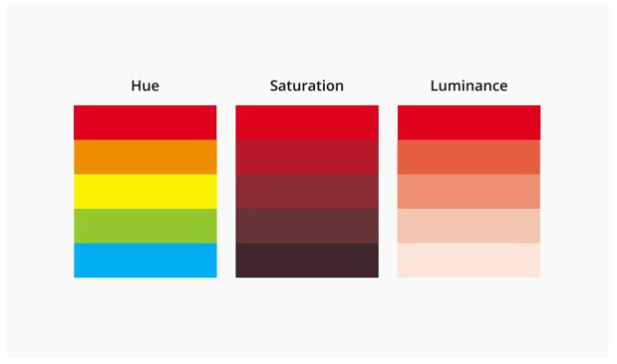
Hue, Saturation and Luminescence
A hue is basically any colour on the colour wheel. When you are using a colour wheel or a colour picker, you can adjust the saturation and luminescence of a hue.
Saturation is the intensity or purity of the colour.
Luminescence is the amount of brightness or light in a colour.
Colour meanings and colour schemes
This is just an introduction to the fascinating world of colour. There’s so much more to learn! For instance, did you know that the colour royal blue was created in the 1800's for Queen Charlotte? If you want to discover more about colours, check out our Colour Meanings page – it explores the history and meaning of hundreds of colours. Or if you’re looking for more great colour combinations, check out our Colour Palette Generator or browse thousands of inspirational colour schemes.


Comments